Creating my path in Graphic Design, Art and Writing in Trinidad
Graphic Design in Trinidad and Tobago functioned like a Boys’ Club. To make a more gender sensitive impact one had to focus on finding one’s voice and changing the paradigm in any way possible.
I had an automatic aversion to considering the Advertising Agency for employment. I had heard too many misogynistic comments about its structure. Yet, as I had returned from the United States after pursuing a Masters’ Degree, I had felt that clearly, I was expected by now to have made up my mind about a permanent career.
Having entered the world of Graphic Design with my own Partnerships in The Cloth and The MerMade Shopp gave me the impetus to chart my own course. So, Freelance Graphic Designer and Teacher of Graphic Design was what I would pursue.
————————————
THE COLUMBUS DIARY became my first project as a Freelance Graphic Designer. I worked with my closest friend from my John Donaldson Technical Institute days, Richard Bolai. We reprised the work behind Shades of Grey (A Graphic Design Agency which we had formed after leaving technical college) by deciding to join our names together, calling our new initiative RABt.
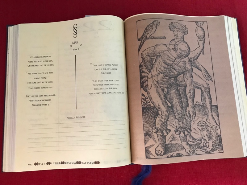
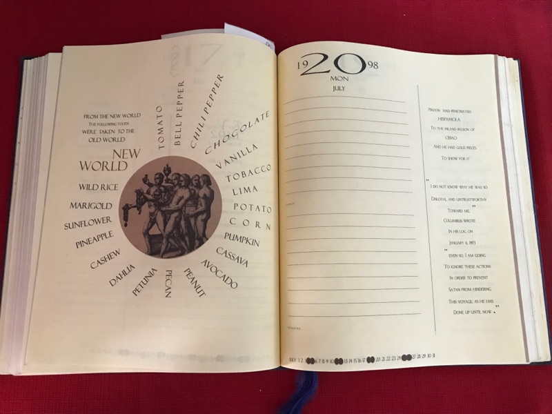
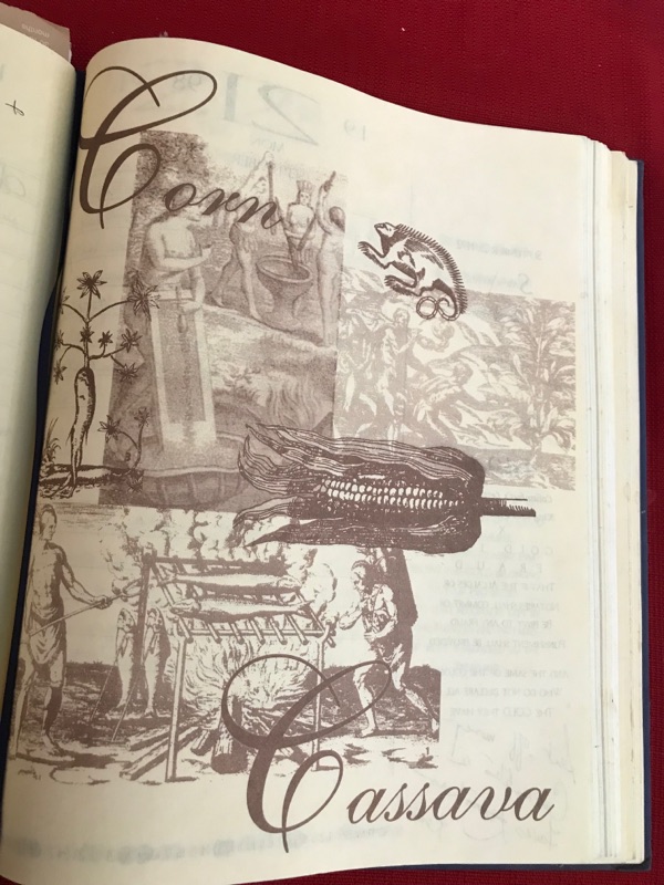
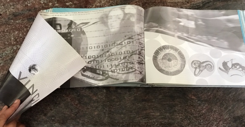
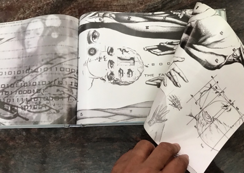
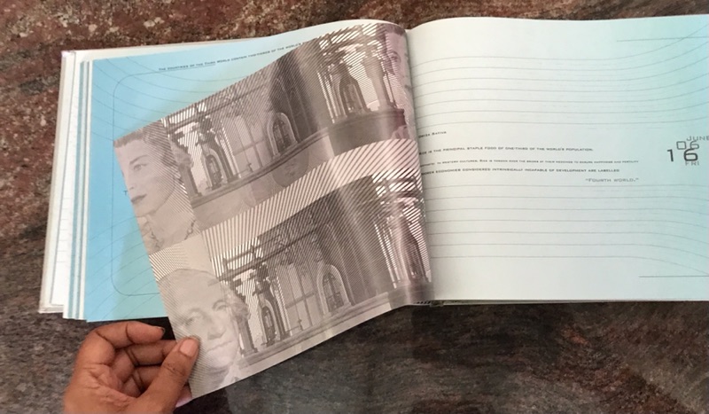
THE COLUMBUS DIARY was a behemoth of a book for first timers. We were looking at conceptualizing an over four hundred page document. The client was choosing a very controversial subject matter and many demands were being made on us. This included researching the subject of Columbus. RABt felt compelled to embrace the challenge of said subject matter by focusing specifically on the contributions of the indigenous peoples within that history.
RABt being newly formed, we also found ourselves working within a specific budget for the publishing. Unbeknownst to us, the printery chosen by the client also had a lot to prove. They had never done a hand bound book before. They were more used to forming and scoring packaging. They wanted bragging rights for themselves in their industry by producing The Columbus Diary. We knew nothing of this until we were well into the book design and started asking their CEO the obvious questions about production.
One of the funny moments RABt faced was the day we were called in to see the finished product. The CEO stood waiting with us to get the first finished diary. As one of the assistants walked in to the office, offering four books for all of us to see, he unceremoniously swept down on all of them. It looked so comical. He was opening one while the other three were cradled under his arm. With a boisterous voice he said that he was going to keep all of them. He and the client had a heated moment. She knew his father who was at that time a major newspaper owner on the island and she liberally used his name, telling him that she’d tell his father about his ridiculous behavior.
The MILLENNIUM DIARY
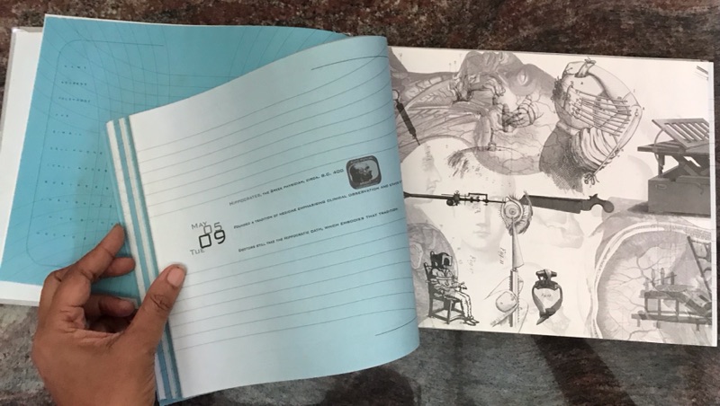
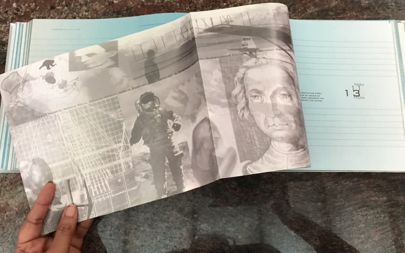
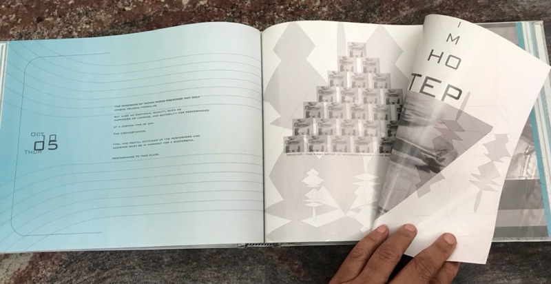
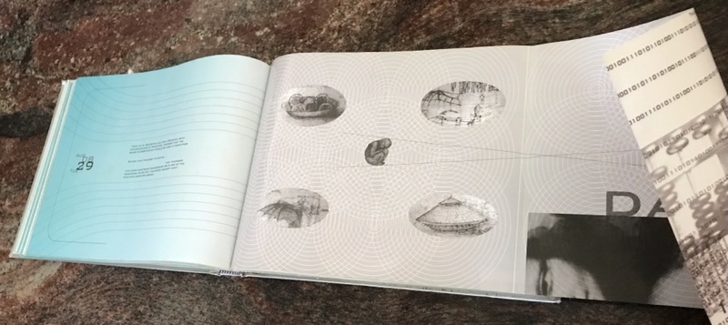
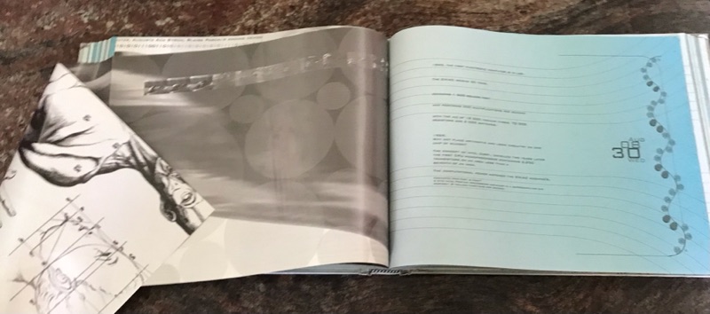
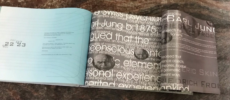
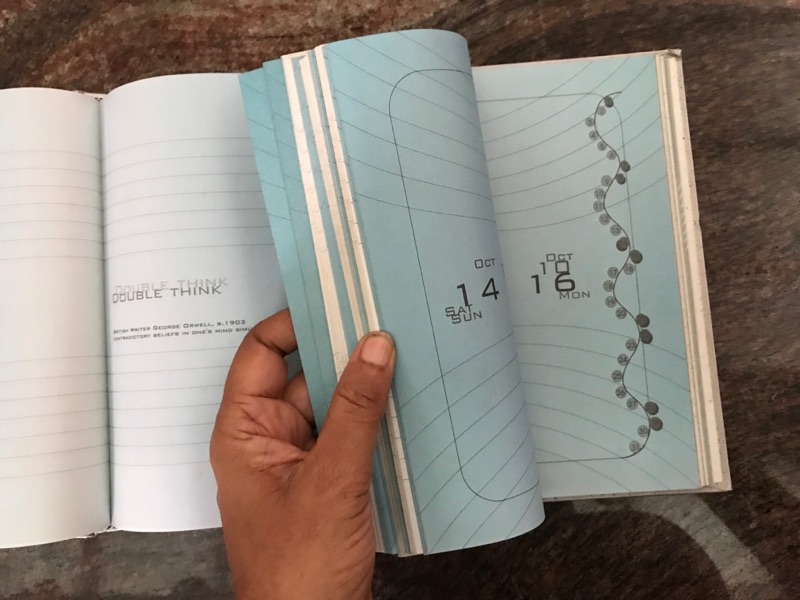
The success of THE COLUMBUS DIARY got us another job with that client. This time she wanted a futuristic looking book to commemorate the new century. Her vision was a silver cover with a hologram sticker. We chose the symbol for eternity. She then wanted the pages to go from dark to light blue and back again like the ebb and glow of water. She wanted images separating the months and folding out like posters.


Comments
Post a Comment